How to Create a Captivating YouTube Thumbnail in Photoshop
Get helpful updates in your inbox
According to recent stats by DemandSage article, YouTube has more than 2.6 billion active users as of 2023. However, though there are over two and a half billion people on YouTube, it’s not a guarantee that your content will be seen — there are millions of YouTube publishers battling each other for views and the competition grows steeper every day. So, how do you get your videos to stand out amongst the masses?
Backlinko recently published an article about how to increase YouTube SEO, and the first item on their list was to create an engaging thumbnail. According to YouTube, nine out of ten most-viewed videos on YouTube use a custom thumbnail. This shouldn’t come as a surprise, because your thumbnail is the face of your video before anyone ever even thinks about clicking on it.
So, how do you create an eye-catching YouTube thumbnail?
What are good examples of successful YouTube thumbnails?
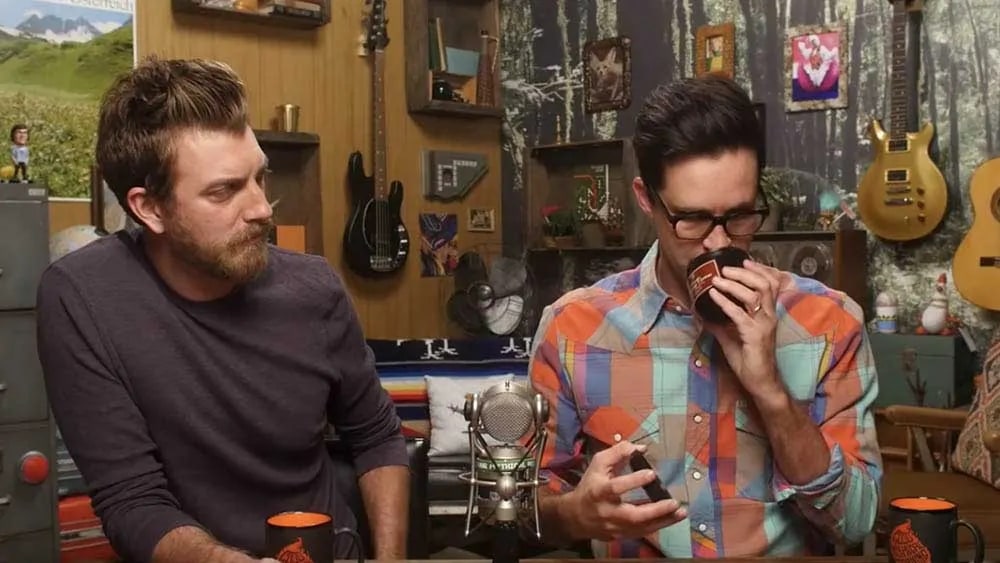
For example, look at the custom thumbnails for popular YouTube channels like Good Mythical Morning. The show uses busy, jam-packed thumbnails with pops of color, bold text, and layers of icons and pictures.
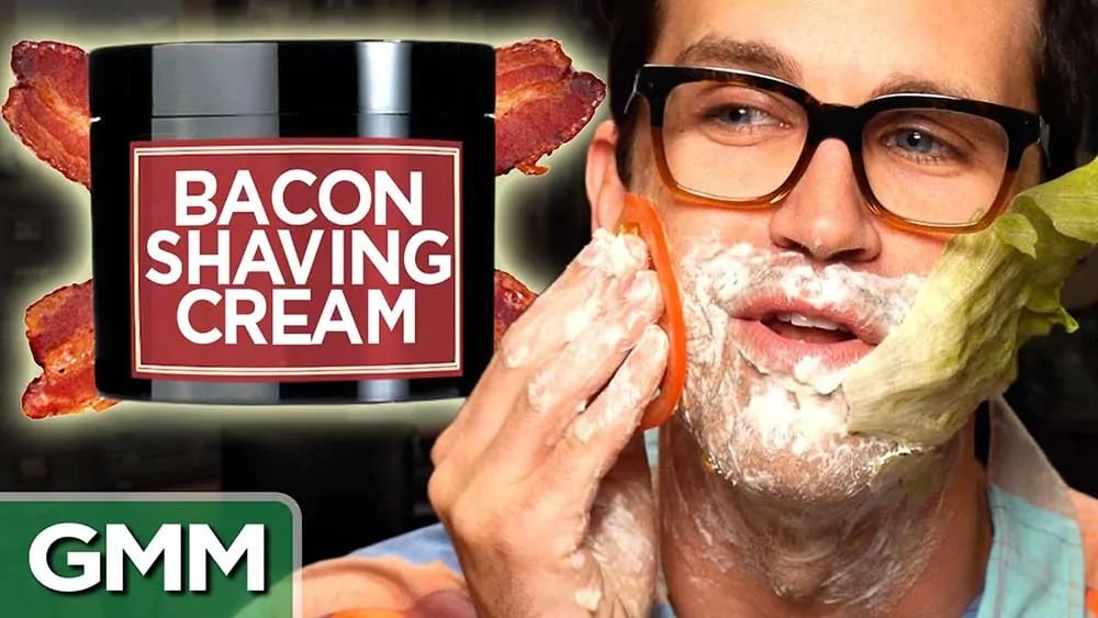
Consider this —below are two thumbnails for the same video. One is a custom-made thumbnail and one is a random part of the video that YouTube pulled as the thumbnail. If you were looking for a video on bacon shaving cream and the thumbnail on the top was next to the thumbnail on the bottom, which one would grab your attention first and would you be more likely to click?
You likely would be more inclined to click on the custom thumbnail on the bottom: it has multiple elements of pictures and text, varying colors, and Link has what appears to have the bacon shaving cream and various burger accessories on his face.
While not all custom thumbnails need to be outrageous, there is a lot you can do to make them stand out against videos with bland or unoriginal thumbnails.
Below, I’m going to walk you through how to make an engaging and eye-catching YouTube thumbnail using some basic composition principles and a few handy Photoshop tools. If you are new to Photoshop, don’t be intimidated—the tools I’m going to show you are extremely easy and intuitive to use and will take you a long way.
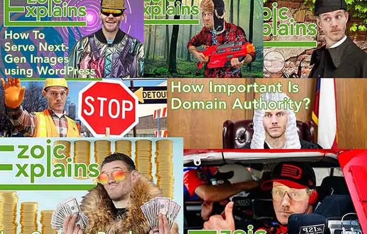
We recently published an episode of Ezoic Explains that shows you each of these steps and tools, though I will go through it step-by-step below.
What should I include in a YouTube thumbnail?
As with any visual element, there are specific design principles that make something, for simplicity’s sake, “look good.” While it may seem like an ungrounded artsy concept, these principles are actually rooted in psychology; the more a person feels comfortable or engaged in your image, the more likely they are to pay closer and longer attention (much like what we try to do on websites to increase time on site and pages visited).
Following some of the basic rules of composition and design will help your thumbnail both standout and “look good.” A downloadable PDF with the basic composition principles, Photoshop tools, and keyboard shortcuts is available here.
Balance: this includes symmetry, asymmetry, and “rule of thirds,” and weight
Symmetry: when something is exactly reflected over the center.
Asymmetry: when the objects are not exact replicas of each other, but the weight of the objects or positive/negative space is the same.
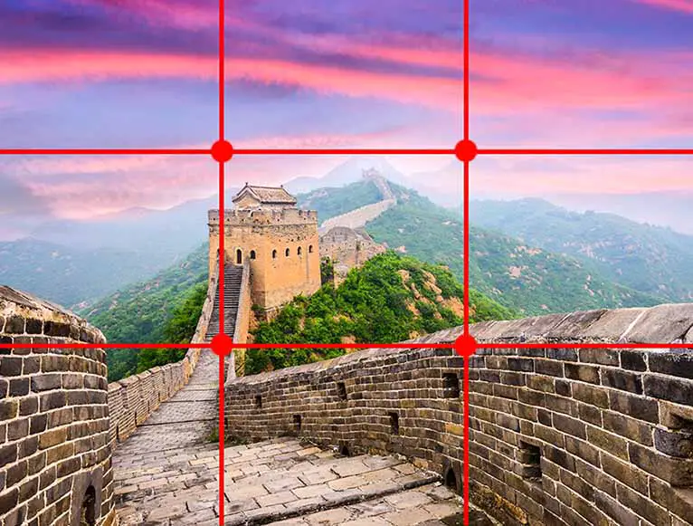
Rule of thirds: this is mostly used in photography but I find it helpful when I am creating asymmetrical designs. It has us imagine a frame as if it were divided into thirds both horizontally and vertically; elements in the frame should fall somewhere on these lines, especially in the “hot spots.”
The rule of thirds/asymmetry is shown below. The tower falls on the first third of the photo and both the beginning of the stairs and the roof of the tower are positioned very close to the crosshatches, or “hot spots.” The photo is balanced asymmetrically because while the tower carries a lot of weight on the left-hand side, the wall on the right-hand side is in the foreground and thus carries a significant amount of weight in the photo as well.
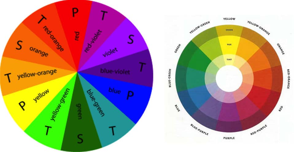
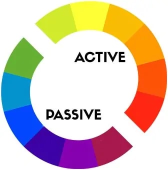
Color Wheel: shows the relationship between colors. Knowing a few color relationships can be helpful when creating a thumbnail because certain colors complement each other, move forward or backward in a frame when placed together, or create better harmony. By choosing certain colors and color pairings, you can send a message to a viewer before they even know what the content is about.
P: Primary Color (colors that stand on their own; “true colors”)
S: Secondary Color (colors made by combining two primary colors, e.g. yellow + red = orange)
T: Tertiary Color (colors made by combining a primary and secondary color, e.g. yellow + green = yellow-green; primary color always listed first)
Hue: true colors
Shade: true color + black
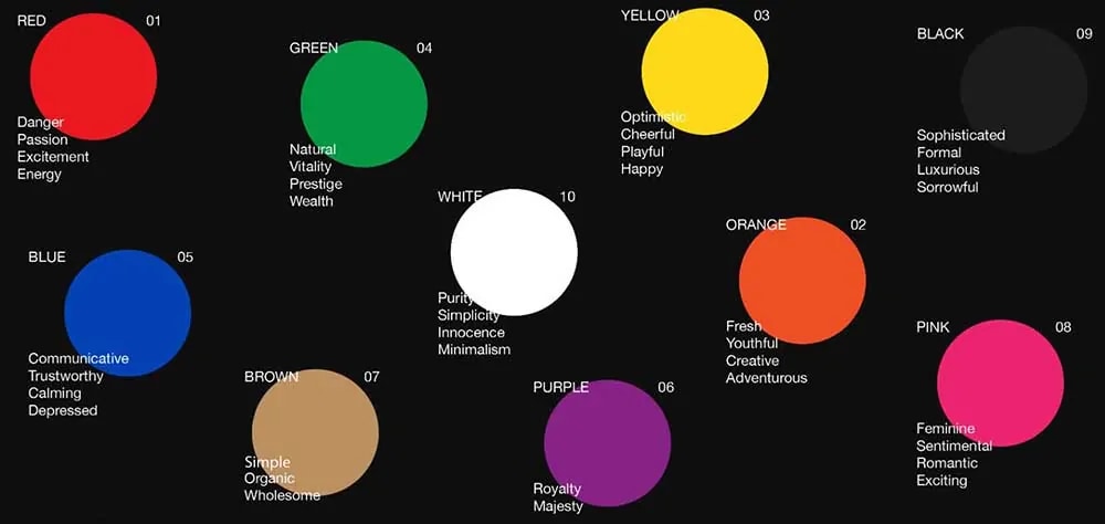
Color symbolism: each color represents a meaning or mood. Depending on the message you want to send, you may choose a certain color over another. Think about your favorite brands, what colors they use, and what message they are trying to send to potential consumers.
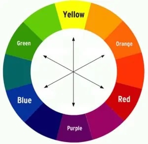
Complementary colors: colors opposite each other on the color wheel.
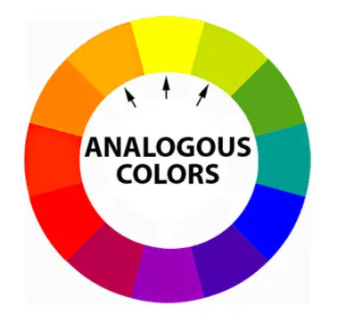
Analogous colors: colors close together on the color wheel.
Active colors: these colors are the warmer hues on the color wheel that seem to move forward when placed against passive colors.
Passive colors: these colors are the cooler hues on the color wheel and appear to recede backward when placed with active colors.
Negative and positive space: how much content is on the page versus the empty space around it. Negative space does not mean passive, however. In this example, FedEx uses the negative space between the letters to create an arrow.
If you want something to seem busy or exciting, you would want to use less negative space; if you want something to seem more simplistic or sophisticated, you will want to use more negative space.
Negative and positive space also fall under balance, because you are balancing the weight of positive and negative space.
Easy-to-use Photoshop tools and shortcuts
Photoshop can seem daunting, especially to those who have never used it before. However, there are a few tools that can get you a long way, and once you know some of these basic tools and keyboard shortcuts, learning other tools will come much easier.
Mac and Windows: hold Shift while clicking and dragging
This will create a perfect circle, square, triangle, and straight line
What are the best colors for YouTube thumbnails?
Choosing a color scheme is one of the most important decisions regarding your thumbnail; once this is chosen, everything else you do will need to follow suit.
Backlinko’s article suggests making BOGY thumbnails, which stand for blue, orange, green, and yellow. The reason these four colors are a top choice for YouTube thumbnails is that YouTube is primarily red, black, and white; in order to contrast with YouTube’s color scheme, it’s best to try to steer clear of these colors as best you can or use them sparingly.
If possible, try to incorporate some of your brand colors or imagery, as this will immediately associate your company with the content.
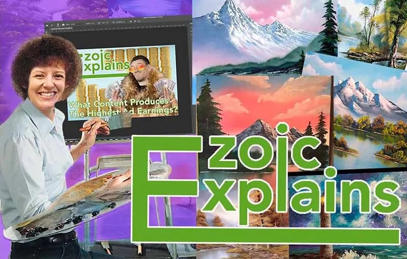
When I’m designing thumbnails for our video series Ezoic Explains, I primarily make the thumbnails as colorful as possible and use our Ezoic green for the font, which contrasts nicely with red because they are complementary colors.
When I make the Ezoic Explains thumbnails, I typically try to create play-on words with the title. When I thought about targeting, I was reminded of hunting. So, for this thumbnail, I had Tyler pose for me like he was holding a gun, and then I found a forested background, water gun, and hat to include in the thumbnail.
While brainstorming your thumbnails, you will want to double-check that you are in compliance with Google’s ad policies; Google will not serve ads on websites related to weapons, which is why I used a water gun.
How to create a YouTube thumbnail template in Photoshop
To show you design principles and basic Photoshop tools, I am going to walk you through how I made the thumbnail for the Ezoic Explains video that corresponds with this blog post.
What is the right YouTube thumbnail size in Photoshop?
To begin, open Photoshop and select File > New. Create a thumbnail at 1200px x720px. Since this will be on the web, the resolution only needs to be 72 ppi. This will help with file size, as YouTube thumbnails must be below 2 MB.
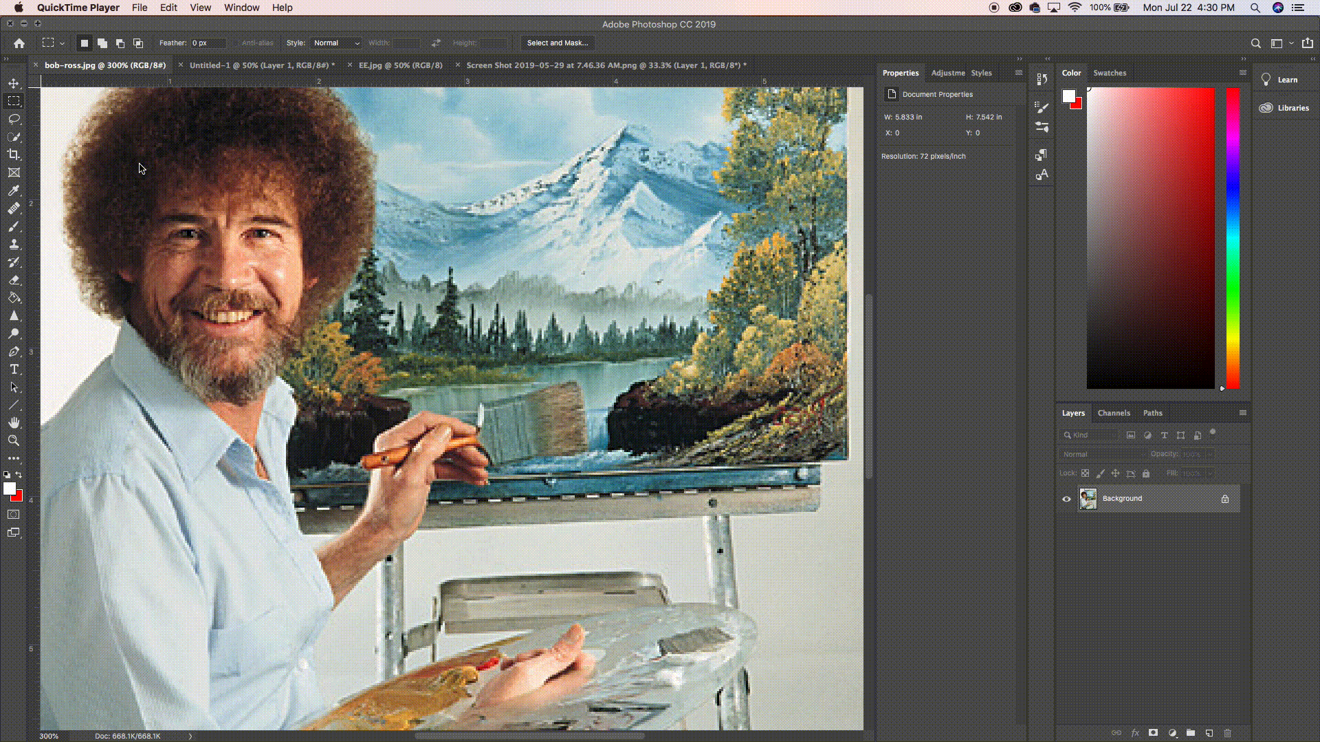
After setting up the Photoshop template, you will need to find photos and/or graphics to include in your thumbnail. For this thumbnail, ‘creating’ made me think of Bob Ross. Since we’re discussing how to make a YouTube thumbnail using Photoshop, I decided I would place my face on the body of Bob Ross while he is painting, but then have him ‘painting’ a YouTube thumbnail I’ve made for a past Ezoic Explains episode.
How do I start creating a YouTube thumbnail?
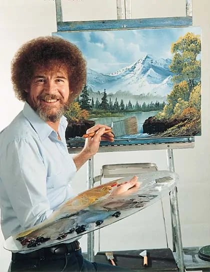
To get an idea of where to start, I first Googled Bob Ross to select a photograph of him painting; I chose to begin here because the rest of the thumbnail’s composition will rely entirely on what kind of picture of Bob Ross I find.
When searching for photos, I typically like to ensure it is a larger photo; as stated before, I can always scale it down but photos lose quality when you try to make them bigger.
To do this, go to Google and search for an image. Once the results are served, navigate to Settings > Advanced search. From the image size dropdown menu, select large.
The less complicated a photo, the better. If there are too many elements to work around and include, it becomes very difficult to make it seem more realistic and will end up giving you a headache.
I liked this one of Bob Ross because he is basically facing forward, which will be much easier for me when I place my face over his. When placing something like a face onto another person’s body, the angle and perspective should closely match the angle and perspective of the original photo; this will make the picture much more believable to the audience and for you to Photoshop.
It will also be pretty easy to Photoshop a ‘canvas’ of a previous thumbnail I have made because he hardly overlaps any of his paintings. Why this is important will become apparent later. I’ve saved the photo of Bob Ross onto my computer and opened it in a new tab in Photoshop.
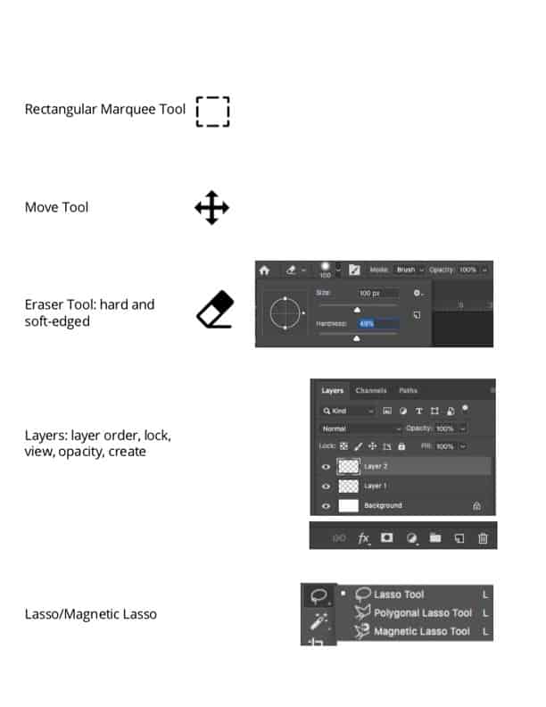
The first tool I used in Photoshop is the Rectangular Marquee Tool from the toolbar on the left-hand side; it is the second tool from the top. By clicking and dragging from one corner of the picture to the other, I am going to select the entire image within a rectangle. Once you release the mouse, you will see a rectangle of moving dashes; this lets you know that you have the content within the rectangle selected.
The Rectangular Marquee tool used in this gif is the second tool within the vertical toolbar on the left-hand side.
Next, I want to copy the selection by either going into the Edit dropdown menu and clicking Copy, or by holding Command + C/Control + C (Mac/Windows). After that, I returned to my blank canvas and pasted the image or Cmd/Ctrl + V.
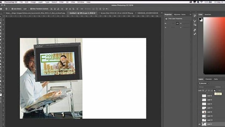
In another Photoshop tab, I have opened up a screenshot I took of a previous Ezoic Explains thumbnail I made within Photoshop. I used the Rectangular Marquee Tool to select the entire picture, returned to the landscape canvas that I have already copied and pasted Bob Ross onto, and pasted the screenshot. Now, I have a 26”x17” white canvas with Bob Ross and the screenshot.
I want the screenshot to be rotated slightly and placed on the easel as the canvas. To do this, I selected the Move Tool—the first tool in the toolbar—and held down the mouse on the screenshot as I moved it over to the canvas.
Once you release the mouse, you can move it to one of the four corners of the screenshot and the mouse will change to a curved arrow. This will allow you to rotate images. Once you have it angled and placed how you would like, click anywhere outside of the image to release it from the selection.
I used the Rectangular Marquee Tool to select the screenshot I took of a previous Ezoic Explains thumbnail, and then copied and pasted it into my project to act as the canvas. I used the Move Tool to move the new canvas onto the easel and then used the Move Tool’s rotating arrows to resize and angle the new canvas appropriately.
Another helpful know-how within Photoshop is understanding how layers work. On the right-hand side, you will see a list of Layers numbered Layer 1, 2, etc., depending on how many items you’ve copied and pasted. Every time you add something new to Photoshop–whether it be a picture, graphic, or text–a new layer is automatically created.
This not only keeps things tidy but allows you to rearrange what items are in the foreground and what are in the background. Whatever layer is at the very top of the list is in the closest foreground and whatever is at the bottom of the list will be behind everything else in the photo.
Layers can be renamed to help you keep track of what is what. You can also hide a layer by clicking the eye next to it, or you can lock it in place or prevent it from being edited by selecting the layer and then clicking the Padlock button in the horizontal toolbar directly above the layers list. There are many other things you can do with the layer tools, like changing the opacity or placing a filter on it, but that will just take experimentation.
What are the easiest tools to use in Photoshop?
Now, I need to place the canvas behind Bob Ross but still keep it in front of the easel. This is when we are going to get into some of the most important tools in Photoshop.
First, I hid the layer of the canvas by clicking the eye next to the layer. Next, I selected the Bob Ross layer because I need to pull a few items that need to be in front of the canvas: his hair, face, hand, and paintbrush.
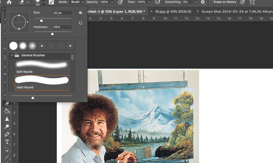
To get a more precise selection than the Rectangular Marquee Tool, I used the Lasso Tool, which is directly below the Rectangular Marquee Tool. I used two types of lassos in this project, but the first one I used is the Magnetic Lasso Tool. To access the other lasso types, hold down the Lasso Tool; a dropdown menu will appear and the Magnetic Lasso Tool is the last one in the menu.
Here, I use the Magnetic Lasso Tool to trace around his hand. To fully select it, I have to close the circuit.
The Magnetic Lasso Tool allows you to grab a section of a picture with relative precision. If I need to select his hand, I choose a point right on the edge of it and click. Now, whatever way I move the mouse, the Magnetic Lasso Tool will automatically start to hug what it sees as a natural line. You can keep better control of the line by clicking as you move along, creating points. This will basically make the Magnetic Lasso Tool work like a connect-the-dot. To finish the selection, complete the circuit.
Once I had his hand-selected, I copied and pasted the selection; this created a new layer with just the hand. To place the hand and deselect, I pressed Cmd/Ctrl + D. Then, I moved it directly on top of his hand in the original Bob Ross layer and ensured the hand I just created was the topmost layer.
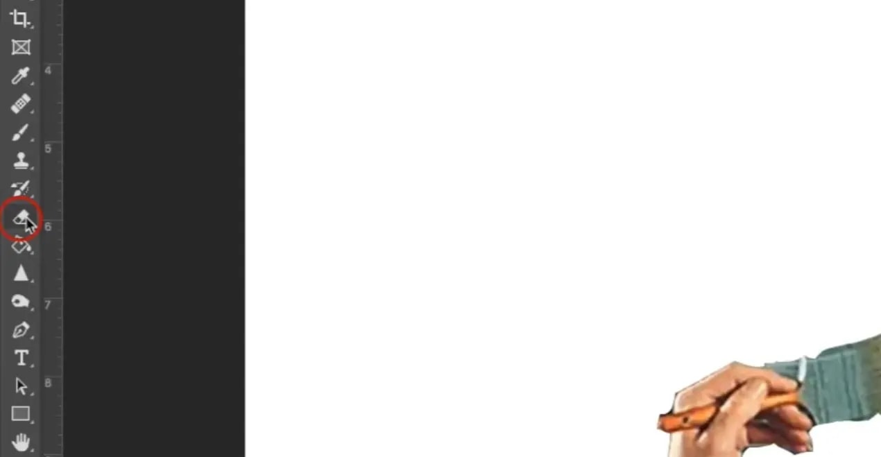
After that, I cleaned up the edges. I hid the layer with Bob Ross on it so I can starkly see the edges of the hand against the white background. To do this, I am going to use the Eraser Tool, which is about halfway down the toolbar. Once the eraser tool is selected, you can change its settings to fit your needs. In the horizontal toolbar at the top of Photoshop, there is likely a circle with a number under it; in this example, it has the number 70 under it. The number just refers to the size of the Eraser Tool.
The edges of his hand, the wooden handle of the paintbrush, and the metal section of the paintbrush are all pretty distinct lines, so I am going to keep the Hardness of the edge up to 100%. For the brush hairs, I reduced the Hardness down to about 25% so the edges were more hair-like.
The Eraser Tool has multiple settings to try. One of the most important settings is the hardness and size of the brush. Other tools within Photoshop that we don’t go into in this thumbnail, like the Brush/Pencil, Dodge/Burn/Sponge, Sharpen/Blur/Smudge tools all use these same settings.
The size of the brush can be changed in this menu or by using keyboard shortcuts. The keyboard shortcut is a lot more efficient because you can quickly change the size of the Eraser Tool while you’re working on something. To change the size of the Eraser Tool, simply press [ (smaller) or ] (larger).
I used the hardest setting of the Eraser tool around his hand and the metal edges of the brush. I turned down the hardness of the Eraser when cleaning up the ends of the paintbrush.
Once I cleaned up the paintbrush and hand, I rearranged the layers so that the Bob Ross layer is at the bottom, the screenshot is in the middle, and the hand we just cleaned up is on top. Now, once all of the layers are visible, I have Bob Ross’s hand in front of the canvas. I took these same steps when I copied his hair and shirt, using a sharp-edged Eraser for his shirt and a very soft-edged Eraser for his hair.
Then, I moved the layers I created and cleaned up to the very top. Now, I have a picture of Bob Ross ‘painting’ on my Photoshop canvas.
How to use the Opacity and Color Balance tools in Photoshop
As stated before, I needed to use a photo of my face that was the same perspective as Bob Ross’. In the photo I chose, I am basically facing the camera head-on, and my face is angled the same way.
To select my face, I once again used the Lasso tool, though this time I just used the regular Lasso tool since it doesn’t need to be quite as precise; it is easier to erase away unneeded parts later than realize you didn’t quite get everything you needed.
I chose a picture of my face that was similar to the direction Bob Ross was facing and the angle of his face. Then, I used the Lasso tool to select my face and copied and pasted it into the project.
I copied and pasted my face into the workspace, used the Move Tool to place my face over Bob Ross’ face, and placed it at the top of the Layer list so it was in the foreground. To ensure my face is the same size and angle, and that my facial features line up with his as much as possible, I selected the Layer with my face and turned down the opacity just enough to see through to his facial features.
While still in this mode, I used a soft-edged Eraser to erase any part of my face that I won’t need.
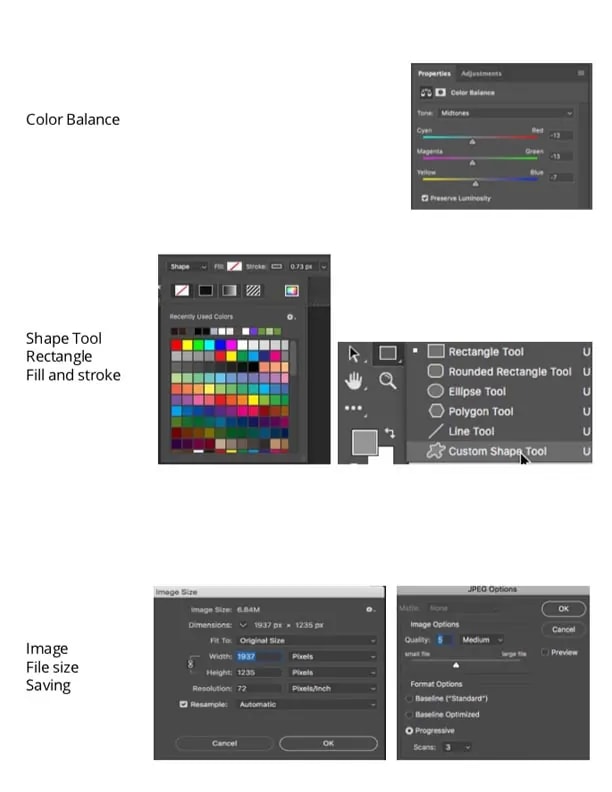
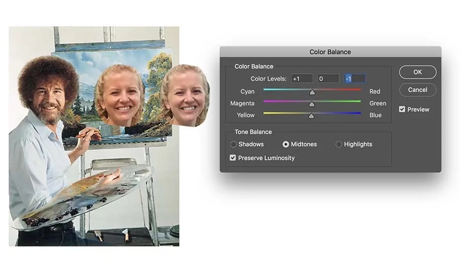
After returning the Layer’s opacity back up to 100%, I saw that my skin tone is just a little bit different than Bob Ross’, most likely because his picture was taken with studio lighting inside and the photo of me was taken outside. To adjust the color balance, I selected Image from the menu at the top: Image>Adjustments > Color Balance.
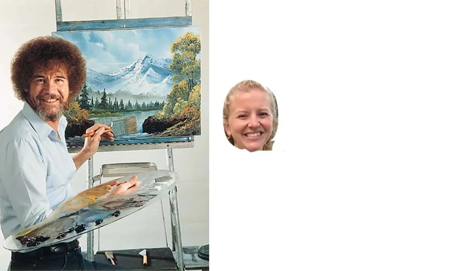
As a comparison, I have here Boss Ross, my face that I edited using Color Balance, and an original copy of my face.
There are three sliding scales you can adjust: Cyan/Red, Magenta/Green, and Yellow/Blue. You can decide whether you’re manipulating the Shadows, Midtones, or Highlights, but I typically just manipulate Midtones. Bob Ross’ face has slightly more yellow and red tones to it, so I increased the Yellow and Red on my face to match.
Now, making it look more realistic is just a matter of using the tools I’ve just described above.
To get Bob Ross’ hair to cover my forehead and the sides of my face, I simply Lassoed his hair from the Bob Ross Layer, copied and pasted it to create a new layer, and then used a soft-edged Eraser to clean up the edges. I used a hard-edged Eraser to clean up the collar of his shirt and simply kept Erasing and adjusting the color balance as I saw fit.
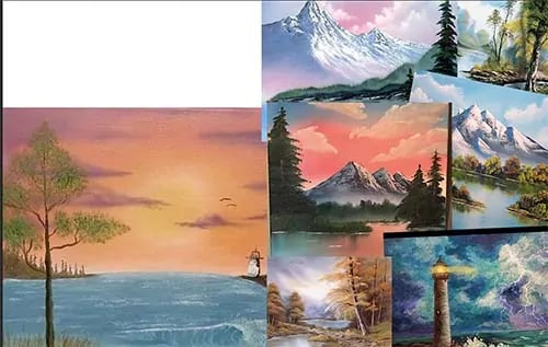
Filling in the negative space and adding color in Photoshop
To fill the negative space, I Googled ‘Bob Ross paintings,’ copied and pasted them into the project (each creating its own Layer), and then rearranged and sized them how I liked. As you can see, I chose paintings with colors that mostly steered clear of YouTube’s colors, yet that would contrast with the green title layer I created for Ezoic Explains.
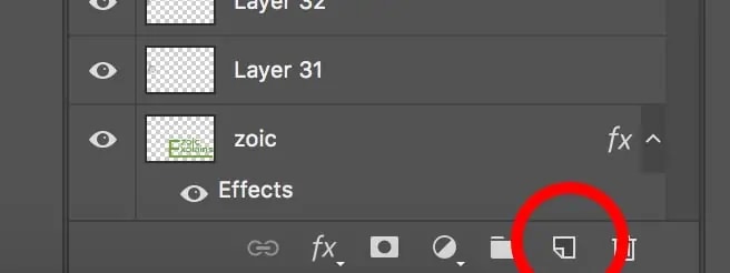
The last addition I made to this project is an overlay Layer to make the negative space directly behind Bob Ross a different color than white since YouTube is primarily white. To do this, I created a new Layer by navigating to my Layers and selecting the New Layer icon in the toolbar at the bottom of the Layer List, which looks like a piece of paper with its corner folded.
While the new Layer is selected, I clicked the Shape Tool, located roughly three icons from the bottom of the toolbar vertical toolbar. By holding down the icon, a list of various shapes will drop down. For this project, I used the Rectangle Tool.
You can make a perfect square or circle by holding down Shift while you click and drag to create a shape. Once the shape is made, you can edit the Fill and Stroke through adjustments in the horizontal toolbar at the top.
Fill: what color is filled in the middle of the shape (can be transparent)
Stroke: what color the shape is outlined in (also can be transparent)
Stroke Density: how thick the outline is (measured in px)
I used purple for the Fill and did not include a Stroke. Then, I moved the purple rectangle Layer to the very top of the Layer List and changed its Opacity to about 40% so I could see through it. I used both soft and hard-edged Erasers to reveal me/Bob Ross, the easel, and the canvas. To eliminate the purple overlay from the paintings on the right-hand side, I used the Rectangular Marquee tool to select the section of purple I wanted to eliminate and then used the Eraser.
With the Marquee Tool, any tool you use will only happen within the confines of the dashing lines, thus the Eraser tool only allowed me to Erase the purple I selected over the paintings.
Now, the white space behind me/Bob Ross has a purple overlay while the paintings and Ezoic Explains title are as they originally were.
What size and file type should a YouTube thumbnail be saved as?
A YouTube thumbnail can only be 2MB or smaller, so you will want to make sure the image size, format, and quality cater to those requirements.
First, always save the file as a Photoshop file (PSD) by clicking File > Save As to keep a copy of the project in this format because a PSD file will keep all of the Layers available in case you want to go back and fix or update something.
After saving it as a PSD file, save it as a JPEG. JPEGs take up less space than PNGs, though it has some restrictions that more advanced projects might find limiting.
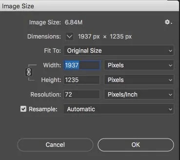
As I stated earlier, I always begin my projects larger and then scale them down as necessary, which I will definitely need to do in this instance. To change the image size, navigate to Image>Image Size. I usually first reduce the pixels to 72 ppi and change the width size to 1000px.
The height should be locked to the width so proportions stay consistent, indicated by two lines coming out of a chainlink and leading to the Width and Height. If the lines are not there, click the chainlink and the dimensions will lock.
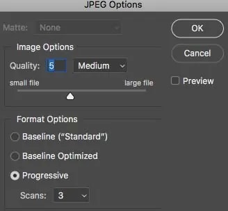
After you click Save, a window will pop up asking what quality you would like the image. For a YouTube thumbnail, mid-range or a little lower will suffice; this will help with file size as well.
Before uploading the file as my YouTube thumbnail, I double-check that the file is below 2MB. If it is still over, I just keep resizing the thumbnail and adjusting the quality until it is 2MB or less.
Stay consistent and engaging with YouTube thumbnails
Your YouTube thumbnail is like the items in a shop window—it’s meant to grab users’ attention and entice them ‘into the store.’ I suggest finding a specific ‘look’ for your thumbnails that you stick with so that your branding stays consistent. This makes it easy for users to become familiar with your thumbnails and easily spot one of your videos amongst others.
Basic composition principles and Photoshop tools have a bit of a learning curve but once you have practice thinking like a designer and using the tools and shortcuts, making thumbnails and other design projects will become much easier. After mastering these concepts and tools, there is much more you can learn about design and Photoshop to continue tweaking and improving your thumbnails.
If you don’t have access to Photoshop, Adobe provides a week-long free trial of its products if you would like to try-before-you-buy.
If you’ve already used your trial or are not interested in purchasing Photoshop, I would research online tools that function similarly to Photoshop and then use the aforementioned design principles and information to knowledgeably create your thumbnail.