[et_pb_section fb_built=”1″ admin_label=”section” _builder_version=”3.22″][et_pb_row admin_label=”row” _builder_version=”3.25″ background_size=”initial” background_position=”top_left” background_repeat=”repeat”][et_pb_column type=”4_4″ _builder_version=”3.25″ custom_padding=”|||” custom_padding__hover=”|||”][et_pb_text _builder_version=”4.0.4″ background_size=”initial” background_position=”top_left” background_repeat=”repeat” z_index_tablet=”500″ hover_enabled=”0″]
How To Optimize Critical CSS To Make Your Website Faster
Ever ran a website speed test and realized that half of the stuff on the list of things to improve don’t seem to be things that are intuitive to fix? Fortunately, you’re not the only one. Even good web developers often struggle to implement some of the pagespeed recommendations that Google and other website speed testing tools push out. One of the most difficult suggestions to implement is optimizing critical CSS.
Below, I’ll walk through how to think about and optimize critical CSS on your website so that you can make your website faster. This includes the classic request from tools to “remove render-blocking CSS below the fold”.
Realize that pagespeed tools — even Google’s — are not really that great at measuring actual website speed.
That said, publishers are often hoping that website speed itself will help with SEO. While it is extremely unlikely that improving a website speed score will have a dramatic impact on SEO, it is possible that visitor experiences could be improved by having a faster site.
Optimizing how critical CSS loads is certainly something that can improve both of these goals.
Get additional tips on how to improve the speed of WordPress websites here.
Get tips on how to improve image loading and serving them in next-gen formats here.
What is critical CSS?
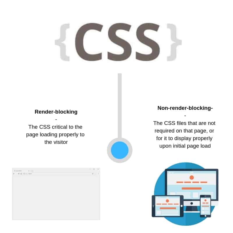
Critical CSS is often referred to as the “critical CSS rendering path” which simply means all the necessary CSS code that is required to render the website in a browser to the website visitor. The visitor will often see a white screen until the CSS stylesheets have been downloaded and parsed. This is why optimizing the delivery of CSS is important to pagespeed and visitor experiences. To improve the loading speed of a website, only CSS that is required to load the viewable portion of a page should be loaded upon request. Since all CSS is render-blocking, this means the page will appear much faster to the website visitor.
This is why pagespeed tools will often tell users to eliminate render-blocking CSS below the fold. This refers to CSS that will not be required to have the page render properly in the website visitor’s viewport.
What CSS is critical and why is some of it “not critical”?
CSS stands for Cascading Style Sheets. CSS is what defines how certain HTML portions of a website are to be displayed. Pages will not render until the requested CSS is loaded. Sites with lots of CSS can take a long time to load.
CSS is usually responsible for a websites layout, navigation structure, theme, and more. It really helps define the standard look and feel of a website.
So, why is some CSS not critical? Wouldn’t it just be easier if you eliminated all the non-critical CSS altogether and avoided the headache of worrying about how you can optimize the delivery of CSS on your website?
Well, here’s the thing. You don’t need all your CSS for every page or every visitor, but you most likely will need all of it at some point. This is what a critical CSS rendering path is…
For example, an article page and a Contact Us page both might require slightly different elements of the CSS. For someone visiting the article page, the CSS elements that are unique to the Contact Us page are not critical to load to that visitor; yet that CSS is still loaded when someone navigates to the article page in many cases because a webmaster will require all CSS files to be downloaded to render the page.
You can see in this example that the website requires all the CSS discussed, but may not need all the CSS for each URL or visit. This means the critical CSS will differ by user and by page on a website.
How do you optimize critical CSS delivery?
As mentioned above, what CSS is deemed critical will vary. Improperly loading CSS can cause all kinds of issues.
Since CSS is render-blocking, loading all the CSS for every visitor on every page will often produce slower website speeds. On the flipside, delaying the loading of critical CSS can result in the page loading completely blank to the visitor.
Typically, if CSS is not properly optimized, or is incorrectly loaded asynchronously, the website will appear as a blank white screen or with portions of the page missing. This includes inaccurately displayed fonts and page layouts as well.
The best way to optimize CSS delivery is to understand what elements are critical, which are critical some of the time, and which ones are never critical.
An example of CSS that is always critical might be the website background color
Below is a list of CSS that is often always critical:
- Background color
- Page styling that is above the fold (or in the device viewport)
- Theme dimensions by device type
- and others…. depending on the site and its unique CSS
Some CSS is only critical in particular circumstances:
For example, the CSS that is critical for a mobile visitor is different from that of a desktop visitor. Mobile visitors only need the CSS that will properly load the mobile version of a page. The CSS necessary for a desktop rendering of a page is non-critical for that visit.
Below is a list of common CSS variables that are only critical in certain circumstances:
- Desktop layouts
- Mobile layouts
- Footer design
- Menu styles
- Certain page types
Lastly, some CSS is truly never critical for a particular site.
For example, a mobile site may have a hamburger menu. The CSS required to hover display to the drop-down in that menu is not critical to the rendering of the page for the visitor. That CSS can be “lazy loaded” once the visitor has rendered the page.
Below is a list of CSS that is almost never critical to render initially:
- CSS that is below the fold
- CSS that is for another device than the one the visitor is using
How impactful is CSS loading to my site’s pagespeed?
The amount of CSS on every website is different. Its impact on the speed will vary depending on the size of a site’s CSS files.
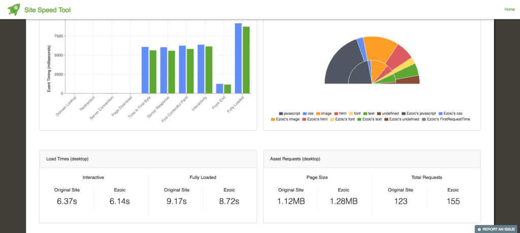
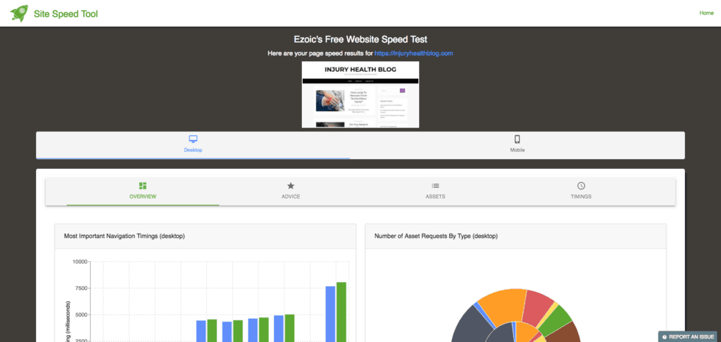
You can use Ezoic’s free site speed breakdown tool to see exactly how big the CSS files on your site add up to. An average site may only have 50-200KB of CSS; however, the delivery of the CSS itself can make the site faster regardless of the file sizes.
Understanding which CSS files are the largest and most important to render for visitors will ultimately determine the impact that optimizing CSS delivery will have on your website.
Ultimately, CSS is moderately important for website speed — depending on how large all your CSS files are, CSS can be divided into the CSS that is critical and needs to be render-blocking, and the CSS that can be loaded after the page renders (non-critical if you will).
What techniques can improve CSS delivery without breaking things?
Optimizing CSS delivery is hard because if CSS that is required to render a page to a visitor is not loaded upon request, the page will either display improperly or display as blank.
CSS can be optimized to speed up a website by loading it “inline” or by loading it “asynchronously” (also known as lazy loading).
We essentially want to figure out the minimum amount of render-blocking CSS required to load the page properly and then use these techniques to optimize the CSS delivery to the website visitor.
Should I load CSS asynchronously?
As mentioned above, not all CSS needs to be render-blocking. We obviously don’t want pages to load improperly, so it makes sense that some CSS blocks the page rendering; however, the CSS that is not necessary for the page to be displayed properly can be served asynchronously.
If critical CSS isn’t loaded upon request, visitors are likely to see blank page or page that loads with errors. Asynchronously loading CSS means that it is loaded after the page is initially rendered for the visitor.
This is a great technique for when you know which CSS files are non-critical to the page loading properly.
How you can use asynchronous CSS loading to make your site faster:
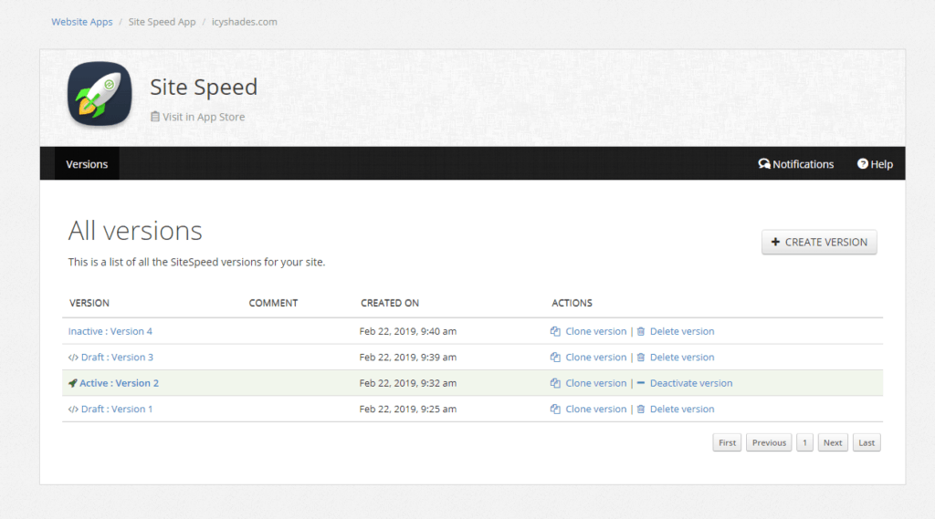
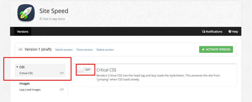
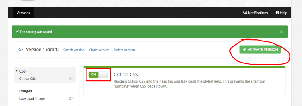
If you’re an Ezoic user, the best and most efficient way to do this is by using Sitespeed app inside of Ezoic.
Simply install the app and use the simple settings to preview and set the CSS settings on your site.
That’s it. You’re done.
If you’re not an Ezoic user, or prefer to tune the CSS by hand, you can use these simple steps.
1.) Go to sitespeed.ezoic.com.
2.) Run your website through the tool.
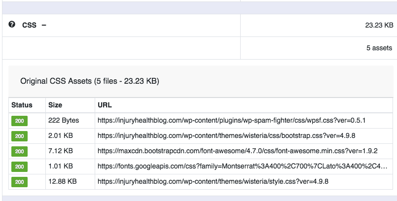
3.) Navigate to the “Assets” tab.
4.) Then click on the CSS + category.
5.) Select each of these URLs one by one and then use one of the following methods to test loading them asynchronously on your website.
- You can use this code below if you would like to hard code this onto your pages:
<link rel=”preload” href=”THECSSFILE.CSS” as=”style” onload=”this.rel=’stylesheet'”>
<noscript><link rel=”stylesheet” href=”URL“></noscript>
<script>
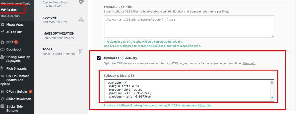
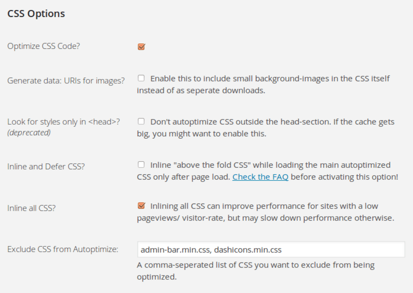
- If you’re a WordPress user, you can use any number of caching, CSS rule, or speed plugins. For this example, I’m going to use Wp-Rocket.
- Login to WordPress and navigate to your plugin.
- There should be a way to “lazy-load” or asynchronously load the CSS. They will either have an option to do it wholesale or to only do it to selected files.
- This is why you needed the URLs from the tool earlier. Those URLs will allow you to easily access CSS files contributing to the sites overall load time.
- You can now either use the plugin to lazy load your CSS files or exclude certain files from lazy loading. WP-Rocket gives me the ability to exclude selected files.
6.) Now, one by one you need to work through a process of elimination if you’re not sure which CSS files need to be render-blocking and which ones don’t.
- To test this, you can try lazy loading all the CSS first and then checking to see if the site loads properly in Chrome’s Incognito mode with a cleared cache and hard refresh each time you add or remove a CSS file.
- Ultimately, you will reach a point where some of the CSS can be loaded asynchronously without breaking the site or making it display improperly.
NOTE: This is the slowest way to do it. If you can read the files and determine which ones are critical to begin with, you can save yourself a lot of trial and error.
What is inline CSS? Should I load CSS this way?
Great question. Maybe.
Google has some guidelines about this.
Inline CSS means that the CSS is loaded in the <head> tag of the site’s HTML. This is faster than the visitor having to download the CSS files directly from the server; however, if all the site’s CSS is displayed inline it can actually slow down the load time of the entire site. Rather than the visitor needing to download the CSS from the server once, the visitor now needs to download the CSS on every pageview.
Inline CSS is great when each page has only the required CSS displayed inline. Non-critical CSS should not be displayed inline. This can actually result in slower page speeds.
How to use inline CSS to increase site speed:
If you’re an Ezoic user, again, this is all done easily using the new, SiteSpeed app in the app store.
[NOTE: If you don’t see the SiteSpeed app in your app store, don’t worry. It should be released to all users in the next week.]
If you don’t have access to Ezoic, or prefer to do it by hand, you can use these steps below in conjunction with the other steps above.
1.) Go to sitespeed.ezoic.com.
2.) Run your website through the tool.
3.) Navigate to the “Assets” tab.
4.) Then click on the CSS + category.
5.) You should have already determined which CSS is critical above. All the CSS files you need to exclude from asynchronous loading can now be loaded in-line.
- To write this in hard code on your site, you can enter the CSS files in the <head> tag like this…
<link rel=”stylesheet” href=”styles.css”>
- To do this in WordPress, you can inject leverage use of injecting inline CSS to your plugins or themes with [ wp_add_inline_style ]. This is considered best practice. It will make it so that it only appears where the existing plugin or themes CSS appears so you don’t have to make it available in-line if the CSS is supposed to be present sitewide.
- There are plugins that do this as well but they are usually not quite as good as doing the CSS inlining yourself.
“Can I use these techniques together?”
Yes! That is the best way to optimize CSS.
When used in combination, these techniques offer the optimal way to minimize the amount of render-blocking CSS used on your website on each page.
The steps above are not the most efficient way to perform these tasks, but if you’re not a developer by trade, you may have trouble doing this successfully without a series of staunch trial-and-error types of tactics.
Again, if you’re an Ezoic user, the free sitespeed optimizer inside of the Ezoic app store will do all of this automatically and give you a few settings that should make this way easier.
How to minimize render-blocking CSS and improve page load times
The hard part for most publishers and website developers is determining which CSS files need to be render-blocking and displayed in-line and which ones can be displayed asynchronously.
WordPress publishers will be familiar with all the great plugins and tools that are available to help implement these practices. Unfortunately, almost all these plug-in’s — including WP-Rocket (one of my favorites) — still commonly breaks the site or offers almost no site speed improvement.
The reason that most tools and plugins can’t get this right is that it can be really hard to tell which CSS files are necessary to render all the time. Additionally, applying the same render-blocking rules to every visitor is tough to do well too. Not every visitor needs the same CSS rules.
For example, if I asynchronously load desktop CSS elements my mobile visitors will enjoy a slightly faster CSS load time while my desktop visitors will see a blank page. I need to ensure that desktop CSS only loads asychrounously on mobile devices.
If you’re a developer, this GitHub project can help you understand what CSS is critical to set as render-blocking and then you can easily write the rules necessary to lazy-load the non-critical CSS. Meanwhile, you can add all the universally critical CSS in-line on each respective page.
The final word on optimizing critical CSS
CSS is a staple of most major websites. The term “render-blocking CSS” has a bit of a bad wrap because of pagespeed tools that often tell webmasters to eliminate render-blocking CSS above the fold.
But, the truth is that you want CSS to block your pages from rendering improperly. The key is optimizing the delivery of CSS so that only the CSS required to load the viewable portion pages is render-blocking. This includes CSS that is above the fold. Unfortunately, this varies by device type, so it does lend itself to a heavy-handed approach.
Using Ezoic’s site speed measurement tool, you can easily see which CSS files are the largest and offer the best opportunity for optimization. You can then use common tools, plugins, or custom HTML codes to try asynchronously loading the various files and inlining critical CSS.
Ezoic’s free Site Speed app simplifies this quite a bit if you’re already using Ezoic and have access to the app store (available soon).
Questions, comments? Leave them below and I’ll do my best to answer them.
[/et_pb_text][/et_pb_column][/et_pb_row][/et_pb_section]

