Having ads on a website is one of the main ways publishers make money from digital publishing. As most publishers are more concerned about their content than ads, it may seem arbitrary where those ads are placed. However, it is actually extremely important for both revenue and user experience.
For Ezoic publishers, ad placement is determined by placeholders set within a website’s content. Your placeholder set up is one of the key components in guaranteeing your site is optimized for both earnings and user experience. Ensuring you have the proper amount of placeholders, the right size, and placement can drastically improve or detract from the overall health of your site.
Adding placeholders for potential testing locations is different than simply just placing ads on your site as other services do. Placeholders are better because they allow artificial intelligence to make ad placement decisions based on real data from users, and then use that information to serve ads to look-alike users. This means each user is getting a catered ad experience that lends itself to better user experience and revenue.
Below, I’ll go through the best way to optimize your placeholders so that you aren’t losing out on revenue while also keeping your site’s UX intact.
What is Ezoic doing differently from other services?
To begin, what exactly am I talking about when I say ‘placeholder?’ A placeholder is a potential ad location. An ad will not show up in a placeholder location every time; rather, it is simply a place where a publisher will allow Ezoic’s AI to test thousands of ad combinations, based on the parameters the publisher has set. This allows Ezoic’s AI to serve the best ad combinations on a per-user basis, earning you more money and improving your site’s UX.
This is different from what other services do. While Ezoic is using artificial intelligence to find the best ad combinations for revenue and UX, other services are simply using the same ad set up on every page. This often includes placing a bunch of ads all over the page to keep RPMs up–in one study we conducted, a publisher moved to a different service and had 25 ads on one page!
Doing this increases EPMV temporarily because advertisers bid on historical data; if the historical data implies that an advertiser should bid high because in the past others have, then they will. However, over time these ads will perform worse because of ad dilution–there are too many ads competing with one another on a given page. Now, that historical data shows that this site’s ads aren’t as valuable as they once were, so advertisers will bid less. Then, the only way to keep EPMV up is to add more ads, and the cycle continues.
The importance of above-the-fold placeholders
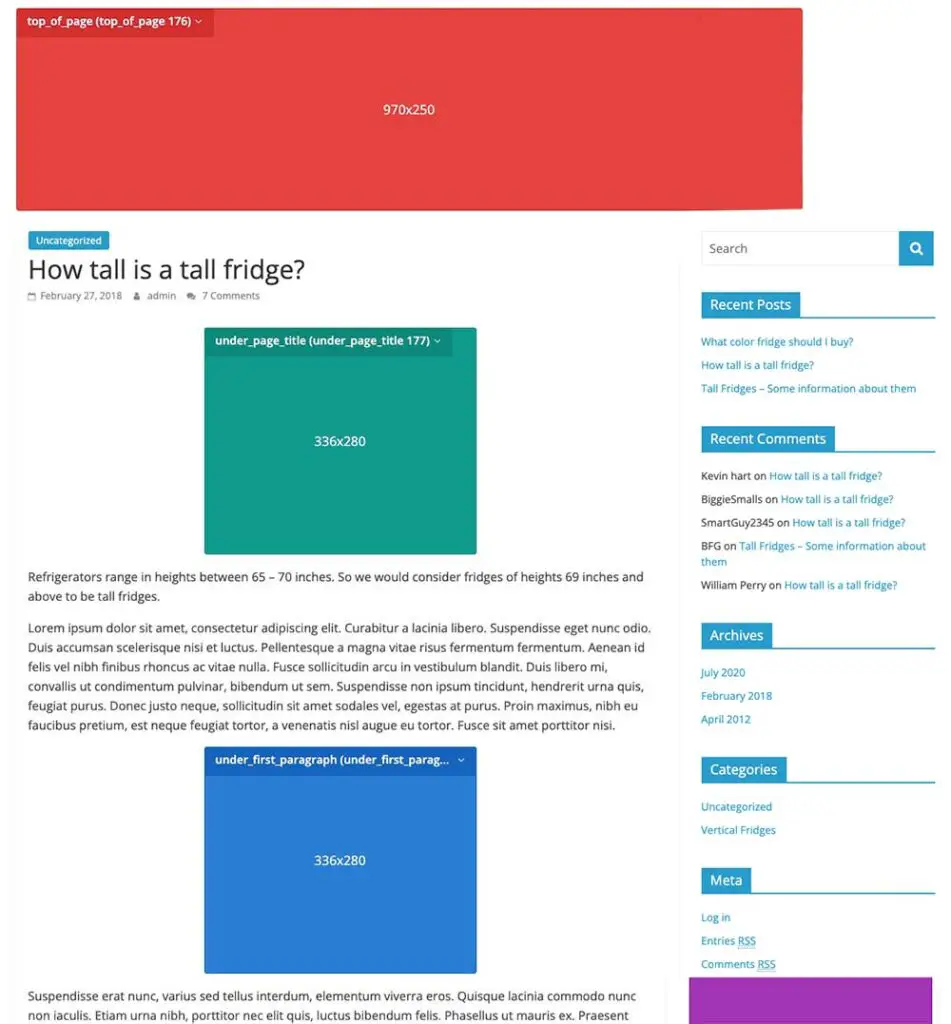
There are optimal parts of a website to add placeholders. Most websites should have somewhere between 10 to 15 placeholders, though it could be more if it is a particularly long article.
We’ll start at the top of a web page and add placeholders as we go. Longer articles will have placeholders more spread out, while shorter articles’ placeholders will be closer together.
Your first few placeholders above the fold are the most important placeholders because they are likely the ones that a user will see. Placeholders should be denser at the top of the page to give Ezoic’s artificial intelligence the ability to test multiple ad locations and combinations.
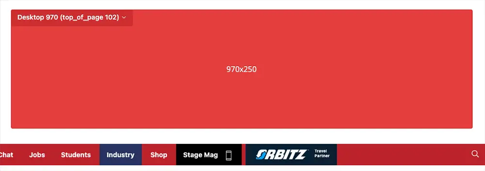
First, a ‘top of page’ banner is one of the most important placeholders you can have for your website because it is likely the first thing a user is going to see when they arrive on the page. It will go above the title and the sidebar. Once you add a placeholder here, you can make a myriad of customizations by going into the edit section.
Here, you can change the name of the placeholder, where it is located on the page, to include adaptive sizing, and what devices the ad will show on. You will also want to turn on mobile for these placeholders. You can also see all of the sizes that are included in a placeholder and what devices they will show up on. Everything is already set up the way it should be, but you can feel free to customize it however you like.
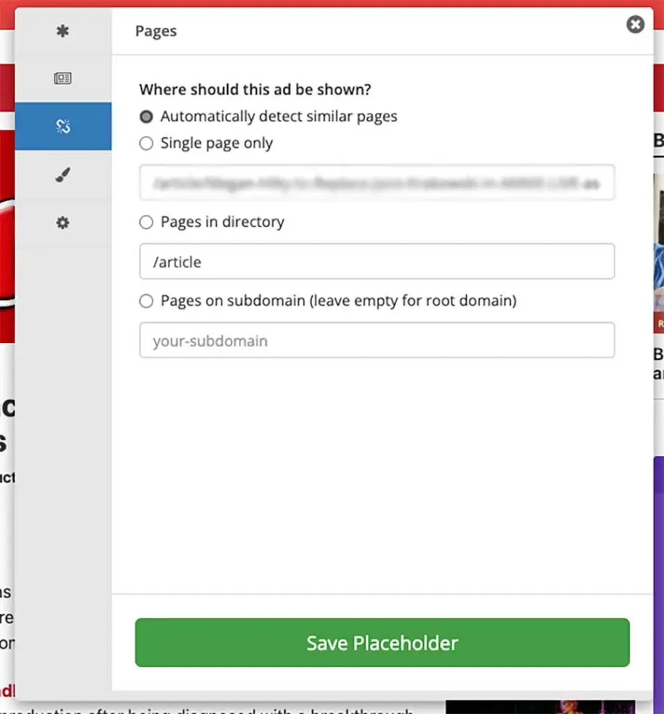
The next tab allows publishers to see if this particular ad should be shown on pages that look like this particular page or just be restricted to a singular page. This is extremely beneficial because this keeps you from having to set up placeholders on every page of your website. Special pages, like the home page, will have to be done separately.
The next location to add a placeholder is a ‘top of page’ ad but this time it will go underneath the title. Because these are the same position type–top of page–only one of these will ever show. It’s important to have both of these placeholders set up because it will allow Ezoic’s AI to test and decide which placeholder will make the most money and provide the best ad experience based on each individual user.
Setting up placeholders for the rest of the page
Most blogs have an image at the top of their articles; if this is the case, we want to set a placeholder under the image. We will select ‘under page title’ for this section.
Next, you want to sprinkle in some placeholders within your content. Every few paragraphs, you’re going to add a placeholder, but make sure you do it in hierarchical order. There are ‘under first paragraph,’ ‘under second paragraph,’ and multiple ‘in content’ placeholders.
Because of the way placeholders work are replicated across multiple similar pages, it is important to add placeholders to common elements. For example, an article may have a list. It would not be a good idea to add a placeholder around the list because not every article will have a list.
Once we get to the bottom of the page, we’ll likely run into some different formatting than the rest of the page. In this example, there’s a ‘Recent Content’ section that we know will show on every article on this website, so adding a placeholder here would be a good idea. We also want to add one at the very bottom of the page called ‘bottom of page.’
Then, we can move to adding placeholders to the sidebar. All of our sidebar placements don’t need to have mobile turned on because most mobile sites don’t have a sidebar. We want to set a placeholder at the top of the sidebar, in the middle, and at the bottom, depending on how long the sidebar is.
After you have all of these placeholders set, you’ll want to check out how it looks on mobile. To do so, right-click anywhere on the page and click ‘Inspect.’ Then refresh the page. Here, you can switch between different devices to make sure everything looks okay.
In the Monetization tab, there are a few settings for your placeholders that will give you the best performance. These settings include turning on Enhanced AI Placeholders, Anchor Ads, and Adaptive Sizing.
Enhanced AI Placeholders find places on a web page that a publisher hasn’t added placeholders and tests these locations. This fills in the gaps of placeholders set up in case a publisher hasn’t put in enough placeholders or doesn’t have placeholders in some optimal locations. Anchor ads place an ad at the bottom of the page that doesn’t move, even when the user scrolls. These ads are high-earning and can provide a great user experience. Adaptive sizing is when there are two ads in one larger ad slot; Ezoic’s technology will only use adaptive sizing if it deems it will be beneficial.
Artificial intelligence for ad placements
Understanding how to set up your placeholders for optimal earnings and user experience is essential to the success of your site on Ezoic. Rather than placing ads statically and providing the same experience for every user, Ezoic’s AI stands out amongst other services because it uses real user data to determine ad locations, amount, color, and more, based on each individual user.
We have a lot of support resources on how to set up placeholders with the Chrome extension, WordPress plugin, and in the Ezoic monetization tab. We also have videos on our YouTube channel and blog posts.

